|
|
Post by admin on Dec 14, 2005 16:59:16 GMT 3
This is the Logo thread, put here you opinions and comments to the logos here is our second logo sets made by Albara ------------------------------------------------------ 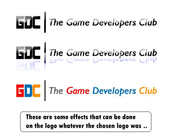 GDC1black 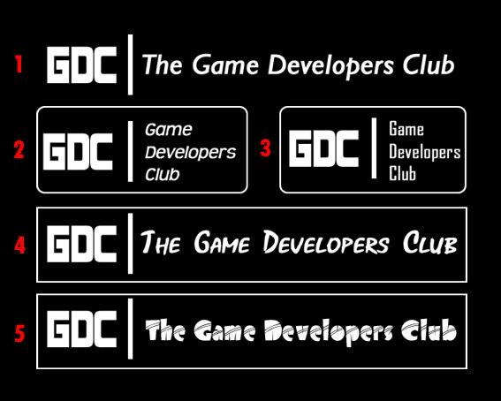 GDC1white 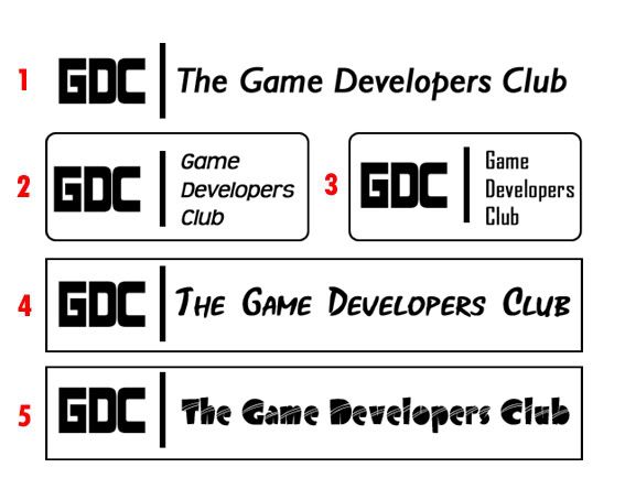 GDC2black 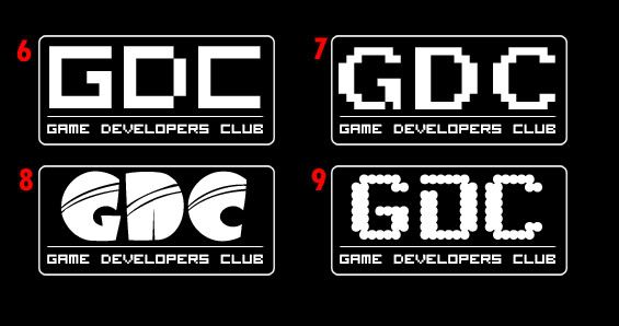 GDC2white 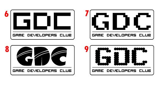 ------------------------------------------------------ here is our first logo made by saleh ------------------------------------------- 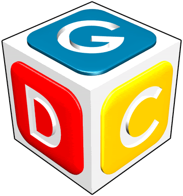 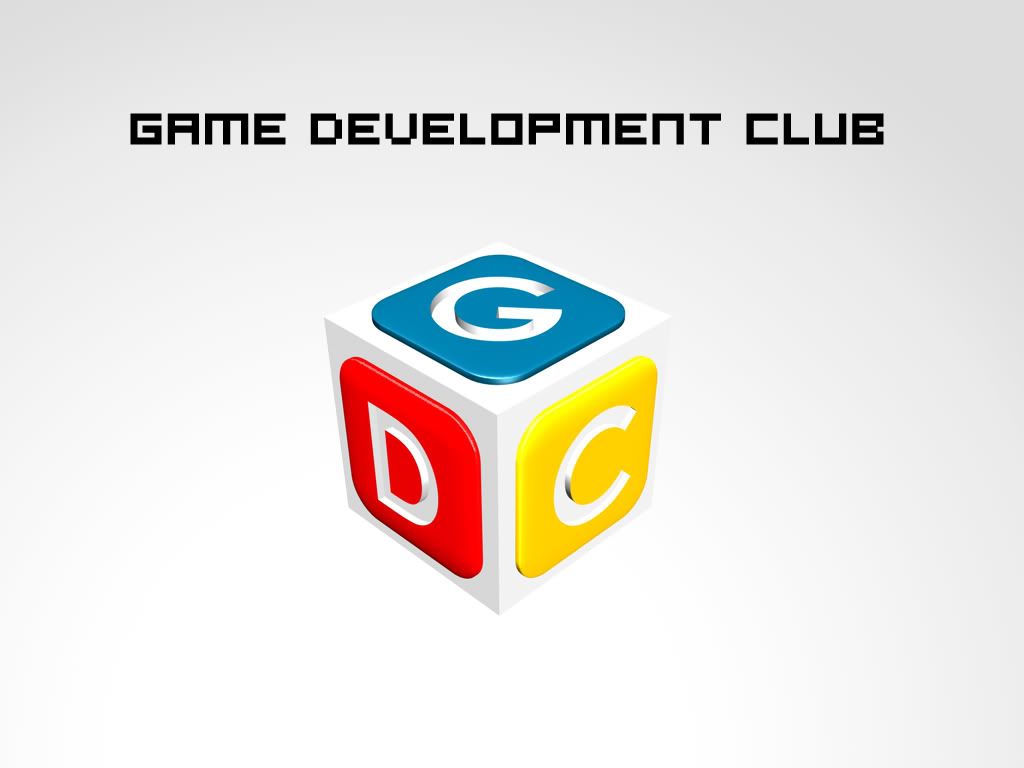 --------------------------------------------------------- Saleh edit this to our liking, the new logo Xbox version! 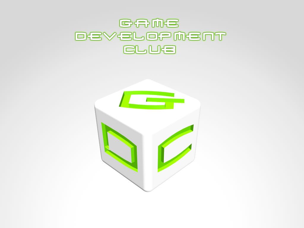 |
|
|
|
Post by admin on Dec 14, 2005 17:08:05 GMT 3
here is some of the comments already sent:
ali yami :
belive it is really good...but how about having a meaning for the colors to distenguishe the inetials of the club name,i.e. the letter (G) with Yello color, the letter (D) with Orange and a Red color for the (C), so any one looks at the logo would know that we start with (G) of the word (Game) and end with the(C) of the word (Club).....so what do you think guys?
bilal ahmed:
Good enuff insha’Allah
s215789 :
The logo is simple, meaningfull, and funny
I liked it, but I think it would be better if you just changed the font to somthing unformal.
Yau:
I think this cool and good enough, unless we get something better.
s242470:
The logo is very good. But it needs a little change in colors. The yellow and red colors are too bright. It might be a good idea to add some texturing as well.
Maan Ashgar:
for myself like it, but I would go for different colors (maybe a darker feeling to it) like black for the cube and red or "xbox" green for the letters.
s215789:
I think that the Full name of the club under the logo is enough to clarify the meaning of GDC, dos'nt it Ali ?
Me again:
Remeber that this logo would go on T-shirts, Ads and club prizes (and other things). If you wont wear it, you dont like it!
|
|
|
|
Post by ali on Dec 14, 2005 18:02:02 GMT 3
s215789,
ok but most logos are seen from the pointveiw of designing and colors more than words ..did you get what I mean!
|
|
|
|
Post by albara on Dec 14, 2005 20:00:46 GMT 3
nice LOGO but i think that we can have better .. lots just wait for the others ..¡ chao  |
|
|
|
Post by Yousef on Dec 14, 2005 20:04:17 GMT 3
I Agree with Al-bara to give more time to see others ..
|
|
|
|
Post by Sherief on Dec 14, 2005 21:40:03 GMT 3
same here...
|
|
|
|
Post by xxx on Dec 14, 2005 22:12:11 GMT 3
I cant see it guys
|
|
|
|
Post by admin on Dec 14, 2005 22:15:59 GMT 3
I still say it need more edge! black or dark blue box,
or how about a black box (sharp edges) with glowing bright Orange letters, and the box has the same orange color edge glowing around it to saparte it from the background
|
|
|
|
Post by admin on Dec 14, 2005 22:18:22 GMT 3
|
|
|
|
Post by Sherief on Dec 14, 2005 22:38:49 GMT 3
photobucket is blocked by the ISU, how did u guys access it?  |
|
|
|
Post by Sherief on Dec 14, 2005 22:46:53 GMT 3
anyways, i have a suggestion to the latest version2 that was posted, switch the G with the D, or keep the arrangment in the 1st version...
|
|
LunarHalo
Orientation
Well... I am not oria -_-
Posts: 10
|
Post by LunarHalo on Dec 15, 2005 15:13:25 GMT 3
Alsalam Alaikum Thanks all for your comments admin:Nice imagination, I will try to model it. albara: thanx, waiting for other logos. ali: Thank you for your opinion. Yousef: thanx, waiting for other logos. Sherief: I think (G) would be better in upper face because it is first letter. Thank you. Thank you all for your comments. For those who couldn't see the photos, here is the thread:gdclub.proboards79.com/index.cgi?board=general&action=display&thread=1134591306 |
|
|
|
Post by admin on Dec 15, 2005 20:11:42 GMT 3
I like 2 in the second set:
1- first image, the colored line
2- GDC2black - 6
|
|
|
|
Post by Sherief on Dec 16, 2005 0:15:05 GMT 3
Question: is it game development or developers?
|
|
|
|
Post by Sherief on Dec 16, 2005 0:16:09 GMT 3
GDC2 BLACK #7
i like the font...has a gaming touch to it
|
|


